
The Psychology of Colour in Marketing and Branding
Have you ever wondered why businesses brand themselves in certain ways? Or ever thought about why a company use a specific colour scheme?
Well, there’s a reason they do and we are here to tell you why. The psychology of colour relates to the art of persuasion which makes it one of the most interesting aspects of marketing. But, also the most controversial one. 1. Introduction: Colour Is Truly in The Eye of The Beholder 2. The Misconceptions Surrounding Colour and Psychology 3. Visual Perception and The Brain 4. The Importance of Colour in Marketing and Branding 5. Different Colours Have Universal Perceived Meanings 6. Social Media Channels: There’s a Reason They’re Blue 7. Factors to Consider When Choosing a Colour Scheme for Your Brand 8. Conclusion: Show Your True Colour A thorough understanding of the psychology of colour is crucial to great design and business marketing. It complements more creative ways of understanding colours, such as colour meanings, the sensations they summon and their applications to design and branding. In this blog post, we have only included what we deem as the most relevant information in the field of colour, marketing and design. 
1. Introduction: Colour Is Truly in The Eye of The Beholder
We often get asked questions like "what is your favourite colour?". Which seems like a perfectly innocent question, right? You may be surprised to find out that your colour preferences reveal a lot about who you are. Colour has a profound and often subconscious effect on the way each person goes about their daily lives. Colour is commonly used to persuade or influence us to make decisions. Essentially colour is a critical influence on how we see society. How you use colour in your business's branding can have a huge impact on how effective you convert prospective customers into genuine sales. However, choosing the right colour for your branding is very important, as it must resonate with your customers when they see your business. Let's take a look at the theory behind the psychology of colour and how we see it to illustrate this importance.
2. The Misconceptions Surrounding Colour and Psychology
The way that colour effects every one of us is down to our personal preferences, moral upbringing, life experiences and cultural differences which can make the psychology of colour quite complicated. So, the idea that particular colours like purple or yellow can provoke a hyper-specific emotion is about as accurate as a standard horoscope that you would read in a newspaper. However, this is what makes colour and branding such an exciting concept. There still so much to learn, so it is important that we accept that accurate answers are no means a guarantee. The key to this is to look for practical ways to make decisions about colour and how the naked eye perceives it.
3. Visual Perception and The Brain
Colour perception is the visual capability of distinguishing various wavelengths of electromagnetic radiation. Colour vision relies on a brain mechanism that treats light with different wavelengths. Colour photoreceptors (the rods in our eyes) only respond to the appearance or lack of light and do not distinguish between particular wavelengths. We can argue the fact that colours are not real and that they are “synthesised” by the human brain to distinguish light with various wavelengths. While photoreceptors give us the ability to identify the density of light, specific detection of different wavelengths through independent channels gives our view of the world additional high resolution and colour.
4. The Importance of Colour in Marketing and Branding
Those who own a business know that branding is the tool that companies use to differentiate themselves from their competitors, but branding is so much more than simply designing a logo. Branding is a business's core identity. It is the visual characteristics that set your company apart from “the rest” and includes everything from the colours you use to the way you communicate with your target audience. One could say that branding represents the personality of the company, so it is essential to keep it consistent to connect and develop strong relationships with your audience. A necessary element to creating a strong brand identity is colour. Surprisingly, there are many companies that get this wrong, but those that think carefully about what colours to use to portray their companies brand usually hit the right mark with consumers. 
5. Different Colours Have Universal Perceived Meanings
While perceptions of colour are somewhat subjective to personal preferences and cultural differences, the majority of colour effects have a universal meaning. Let's take a look at the different colour meanings and the emotions that are associated with each.
Purple
Purple is most commonly known for its creativity and spirituality. It holds the energy and power of red, with the stability and of blue, striking the perfect balance between the physical and spiritual. It's a very interesting colour as it has a calming effect but also gives space for enigma and new ideas. Purple is frequently used to show luxury, loyalty, courage and mystery. A great example of purple being used in branding is by the iconic British luxury brand; Asprey. The company create bespoke jewellery, leather, wedding rings and are a world-renowned company. Asprey has a long-running and established relationship with British royalty which dates back to the first half of 18th century when Queen Victoria awarded the first Royal Warrant. And ever since then, Asprey has held a Royal Warrant for every British monarch. Makes sense that they brand themselves with purple right? 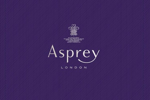
Black
Black is a colour of superiority and independence. However, it can also be used to present evil, mystery, sadness, depression and death. Black is a very reserved colour that entirely lacks light. For this reason, black is an exceptional colour for high contrast and easy readability. Unfortunately, since it’s an extremely powerful colour, too much black can cause sadness and negativity, so this is why the majority of businesses avoid it. If you do want black to be a part of your branding, then we recommend that you use it sparingly.
Yellow
The next colour on this list is yellow. Yellow is associated with feelings of friendliness and joy. Yellow is generally considered to be “the strongest colour,” since it is believed to be associated with the emotions of self-esteem, and creativity. However, the emotion most commonly thought to arise from being presented with the colour yellow is happiness. Wait! Hold on a minute! Is that why emojis are yellow? Did you also know that the colour that is the most easily digested by children is yellow? So, if we combine this with the fact that it is associated with happiness then does it come to any surprise that Adventure Island in Southend-on-Sea use yellow as the primary colour in their branding? Or the fact that many of their rides are also yellow? Mind blown. 
Orange
Orange is an exceptional colour. It isn’t connected with a single feeling or emotion, but it can affect us in several different ways. Firstly, orange is a colour we tend to associate with temperature. If a room is painted orange, we are more likely to assume that it is warmer than it actually is. Orange is also thought to be affiliated with good value. Supermarkets with orange logos, such as Sainsbury's, are perceived as providing high-quality but low-cost products to their customers. 
Green
Green, the colour of beautiful forests, and that highlighter that came in a pack of four but you never used. (If you still have that green highlighter, then listen carefully and make sure that you do not throw it in the bin!). Studies have highlighted that green can increase creativity. They have also found that green is associated with complex thinking and higher-level thought. When we think of green, we typically think of nature and growth, so it’s not surprising that we digest those feelings toward ourselves by associating green with our own personal health or professional growth. With that said, and similar to the previous example of Sainsbury's. Is there a specific reason why the majority of Holland and Barrett's branding is green? 
White
White is identified to represent light, goodness, innocence and purity. It is considered to be the colour of perfection and superiority. White means safety and purity. As opposed to black, white usually has a positive meaning. White can represent a successful beginning. You can use white to imply simplicity in high-tech products. Recognise this company logo? Thought so. 
Red
Red is a particularly powerful, vibrant colour that reflects our natural characteristics as humans whether to show kindness and love or to represent anger. Red is also a very energising colour that can represent excitement and strength but can also be demanding and show aggression depending on the context. Overall, if you're looking to have a compelling appearance or get someone's attention quickly, red is the colour that you need to use. Do you think that its coincidence that high-street retailers advertise sales using the colour red?  Now let's blend the happiness and joy of yellow and mix it up with the excitement that red brings. What is the result? The brand identity of McDonald's. Funny that isn't it?
Social Media Channels: There’s a Reason They’re Blue
Blue is a calming and relaxing colour that accompanies red and yellow as the primaries. Sometimes blue symbolises comfort, sky, passion, water, sleep, trust and safety. More importantly, blue symbolises communication, so it makes perfect sense in regards to websites designed for communication. Blue promotes interaction. Most other colours manage to distract people, but blue disappears as a transparent background and engages consumers more than any other colour. Whether the reason is due to the sense of welcoming, or the evolving sense of transparency as a user scrolls through their social media timeline, each site chooses their design and colour scheme for a specific reason. Facebook's logo is blue because the founder, Mark Zuckerberg, is, in fact, red-green colour-blind, so blue is the most visually appealing colour for him. While, Twitter’s logo/mascot is a bird, so it only makes sense that their blue symbolises the sky on a clear and sunny day. 
7. Factors to Consider When Choosing a Colour Scheme for Your Brand
No matter what design you choose, it is going to use a colour scheme in one way or another. Indeed, the colour scheme is one of the most important factors in attracting customers. It has to be attention-grabbing and engaging. This is the reason why selecting a colour scheme isn’t an easy task. Aside from that, it is also important for you to know the factors that you need to consider when choosing a colour scheme for your brand.
Who Are You?
Dig deeper into who your company is, what solution you provide, what products or services you offer, what the business principles are, and more. It’s essential for you to know this so that you can determine the right colour scheme that reflects who you are.
Who Is Your Target Market?
Of course, the target audience is an essential factor to consider. After all, the design and colour scheme that you’ll be adopting has to attract the target audience. Certain colour combinations look more appealing to men than women. If you are targeting a young generation of consumers, then it will also be different.
Who is Your Competition?
You have to know who the direct competitors are and what colours they’re using in their branding. That way, you can do your research and choose a colour scheme that will outshine them. Remember that the best graphic designers are those who research the marketplace and the competition before creating a colour scheme.
The Design’s Visual Appeal
All branding should be eye-catching but most importantly, it should be accessible to everyone. Make sure that the colour scheme you choose will influence and attract prospective customers. There are some who have visual impairments like colour blindness, although they belong to a very small population in the overall consumer market. However, you have to keep them in mind. Make sure that even those who are colour blind can read the text in your branding.
How Long Will the Design be Used For?
Find out how long the design will be used for. Is it just for a specific event or for a long-time usage? Large corporate companies their like logos to remain fresh and contemporary over the years.
What Will the Design Contribute to Your Business?
The colours that you choose can help the company’s success. You can do that if you consider the company’s goals, mission and vision. Remember that the colours you choose will have a substantial impact.
8. Conclusion: Show Your True Colour
Every colour has its own meaning and represents a particular emotion. For that reason, you need to reflect that emotion towards your target market. If your company has a high energy, use bright, vibrant colours. If it’s serious, you might want to use a more complex selection of colours. When colour hits the human eye, it causes an emotional response that associates consumers to a brand. Wisely chosen colour schemes attract people's attention and help them remember the brand. Subconsciously influencing the choice of the buyer, colours help to improve a company’s reputation. The key is to create a self-effacing but balanced and attractive image that will clearly show the benefits of your products or services and attract prospective customers to your business.  If you would like to find out how we can help rebrand your business, then please get in touch with our knowledgeable team. Call us on 01702 619 139 or visit our contact page today!
