Why it’s Vital to Contextualise Your Logo
 The dictionary definition of a logo is ‘symbol, sign or emblem’; but any business owner, marketer, advertiser, designer, creative, artist (the list really does go on) knows that a logo is so much more. Your logo is a trademark, it’s your brand, your business signature - your visual identity. Your logo should embody your company, sell your product and tell a story; it must be unique, contemporary, recognisable but also classic and timeless. It has to be, and achieve, a lot of things. It can often seem like a daunting task – is it even possible to create a logo capable of all this? The easiest and sure-fire way of ensuring you achieve the seemingly unachievable, when it comes to conception, is to contextualise it; and by that I mean you need to question - what is the context of your logo? Logo 'basics' go without saying; if you’re rebranding then your main focus will be merging your growth with heritage. If you’re creating one for the first time, chances are you’ve thought about your goals and your audience. It’s also likely that its components such as colour, typeface and style, draw inspiration from them. But have you considered, however, the historical, social, economic and political contexts of your logo? While it sounds like a cumbersome task, thinking within these contexts should come naturally – and if it doesn’t, simply research the company and it soon will.
Logos Have The Power to Prompt a Reaction From Consumers
Clever logos can have a psychological influence over the way consumers react to them. Certain elements such as typeface and colour can often draw inspiration from the basic design principles as well as traditional art. When you make specific considerations, the chances are that your logo is going to have a much more positive impact on your target audience and prospective customers.
Logos Play An Important Part of A Brand’s Image
Logos are the most important part of a brand’s graphical representation and the core values that they hold. They are a way of making it easy for consumers to identify a brand and the products and services that they offer. Every single logo that is out there in the marketplace has a meaning that reinforces a brand's character. So, now let's take a look at a few different logos so you can better understand the importance of them.
McDonald’s
Let's face it; you are going to find it extremely hard to find somebody that doesn't recognise the McDonald's logo. It is one of the most iconic logos in history, and it represents so much more than the fast food that they sell. It was created in 1962 and now stands as a modern day cultural icon on a global scale. McDonald's have stuck with simplicity with a typeface that is easy to read, which proves that the simpler a logo design is, the more attractive it is to prospective customers. 
FedEx
The FedEx logo was originally designed in 1994, and when you first look at it appears straightforward right? However, if you take a much closer look at the space between the E and X, you will see an arrow that is right facing. This arrow is a subliminal symbol for precision and speed. 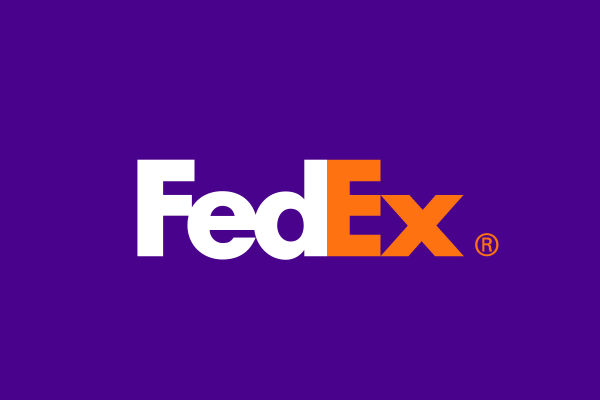
Toyota
You probably didn't see this one coming. Toyota's logo is a lot more than meets the eye and is absolutely brilliant. The business says that their three overlapping ovals symbolise the hearts of their customers. But, it is, in fact so much more than that. When you dissect the logo, it actually spells out Toyota. 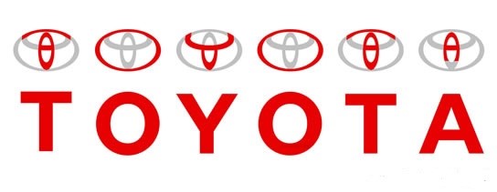 Basically, when it comes to creating a logo for your company, it shouldn’t be taken lightly. There are a myriad of aspects to consider, and it’s paramount to enlist a knowledgeable designer for the job. If your logo is successful it will become synonymous with your brand – and you want that to be an image you’re proud of.
