Revive's Rebrand Adventure
As you might have noticed, things are looking a little bit different around here. Well after months of painstaking planning, hundreds of hours of work as well as the blood sweat and tears of our design team... it's here. We’ve finally emerged bigger and better than ever! Like a beautiful digital butterfly. 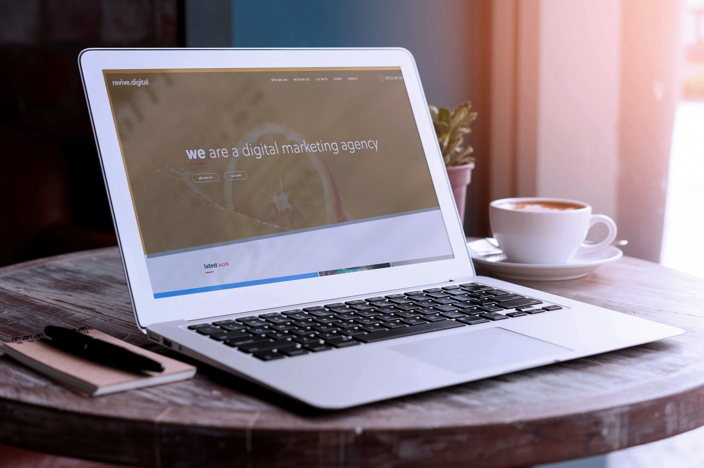 Yes, we’ve rebranded. Everything you know and love about Revive has been enhanced and improved exponentially: from our look, to our website and even our name! All to better reflect the slick way we work and the amount of professionalism that we put into every project we undertake. So what’s new around here? Let me give you the tour.
Times change and so must we
 It’s hard to believe that we’re rapidly approaching our ninth anniversary as a company! With that amount of work behind us, we’ve had time to sit back and reflect on whether our branding truly reflected who we are as a business now. The last three years have seen great leaps forward for us, so we felt that our identity needed a little bit of a revamp to better represent who we are now and where we aim to go in the future. While our previous look will always hold a social place in our hearts, we definitely needed something that better showed our personality, that we’re more than just a web design service.
Short and Sweet
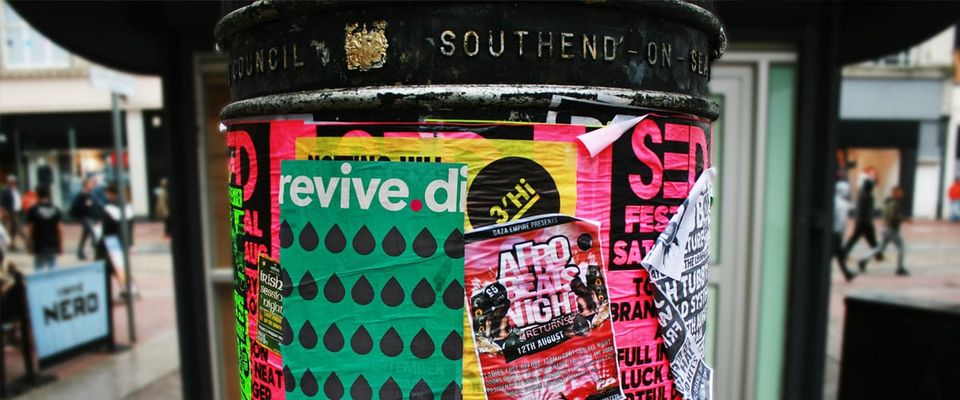
 While our full moniker was ‘Revive Digital Media,’ everyone and their Mum was shortening it to ‘Revive’ for simplicity’s sake and that’s what a title really should be: simple. Dropping ‘Media’ from our title was a quick decision, but still needed to have a title that conveyed to customers what it is we do at a glance: thus the revive.digital rebrand was born.
Clean and Clear
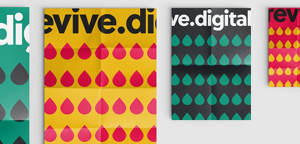
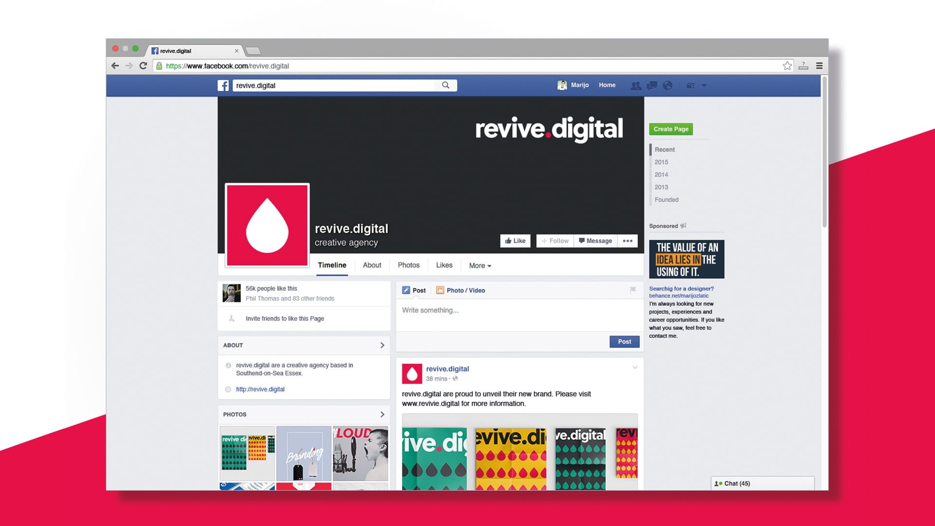
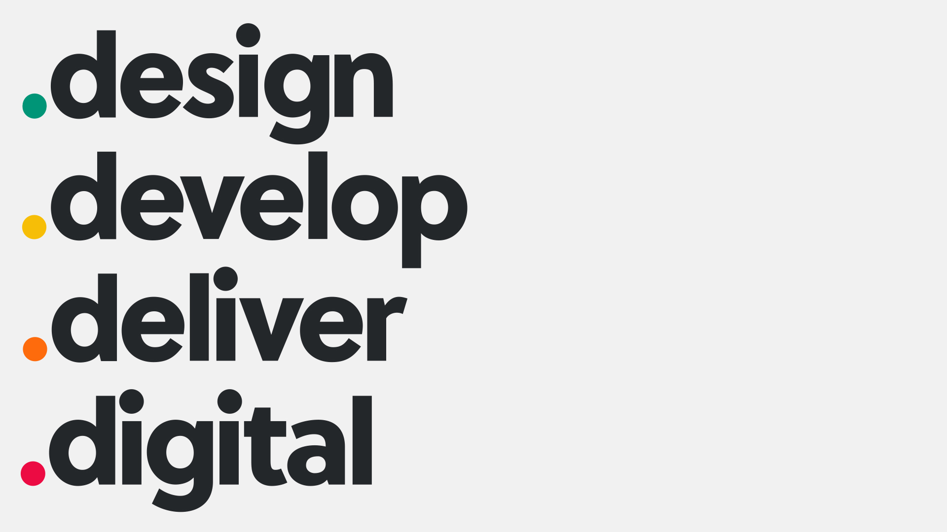 When it came to picking a new visual identity for our rebrand, we went for something simple and clean for the logo, as well as a shorthand symbol alternative for all our social media pages. We needed a look to represent all services that we specialise in, so deicide to ditch the blue and green and infused the brand with ‘Shark’ grey and ‘Ribbon’ red for the main colour scheme. We also devised a secondary colour palette to compliment those two, consisting of ‘Observatory’ green, ‘Amber’ yellow and ‘Pumpkin’ Orange. Each colour picked is there to represent a different area that we specialise in: Web design, digital marketing, graphic design and video. So, what can you expect from us after this rebrand? Well you’ll be pleased to know that we’re still going to be delivering the top-notch digital marketing that you’re used to and we’re going to look a lot better while we’re doing it Make sure to check out our Facebook page for more updates!
