Here’s What We Think of BrewDog’s New Brand Identity
The new brand identity coincides with a huge marketing campaign and set of sustainability initiatives as part of the BrewDog Tomorrow plan. But, has the multinational brewery lost its punk-inspired spirit? 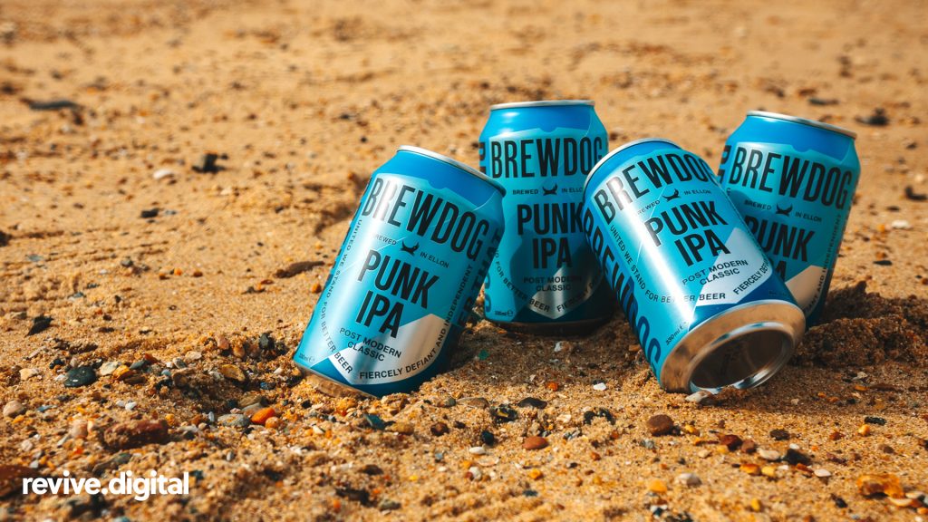
The Story So Far
From brewing beer at the bottom of the North-Sea to controversially bottling beer in taxidermy squirrels; there's no denying that BrewDog started a craft beer revolution in the UK. In fact, the days of bland lagers that are poured from poorly designed and uninspiring glass bottles are long gone. Looking around at all the latest bars that have sprung up on our streets in the last 10 years, it takes no expert to realise that Scotland's beer industry has had a huge influence. And, arguably leading the way in this revolution is BrewDog; the brainchild of co-founders Martin Dickie and James Watt. They started the company out of frustration at the state of beer in the UK and decided to take matters into their own hands. And, since then, they have taken the international drinks industry by storm. When both entrepreneurs were just 24 years old, they leased a building in Fraserburgh, Scotland, and put every last penny they had into a business that completely defied convention. And now, over 13 years later, they have created innovative (and, sometimes controversial) craft beers with a nonconformist brand and now export to over 65 countries across the globe. 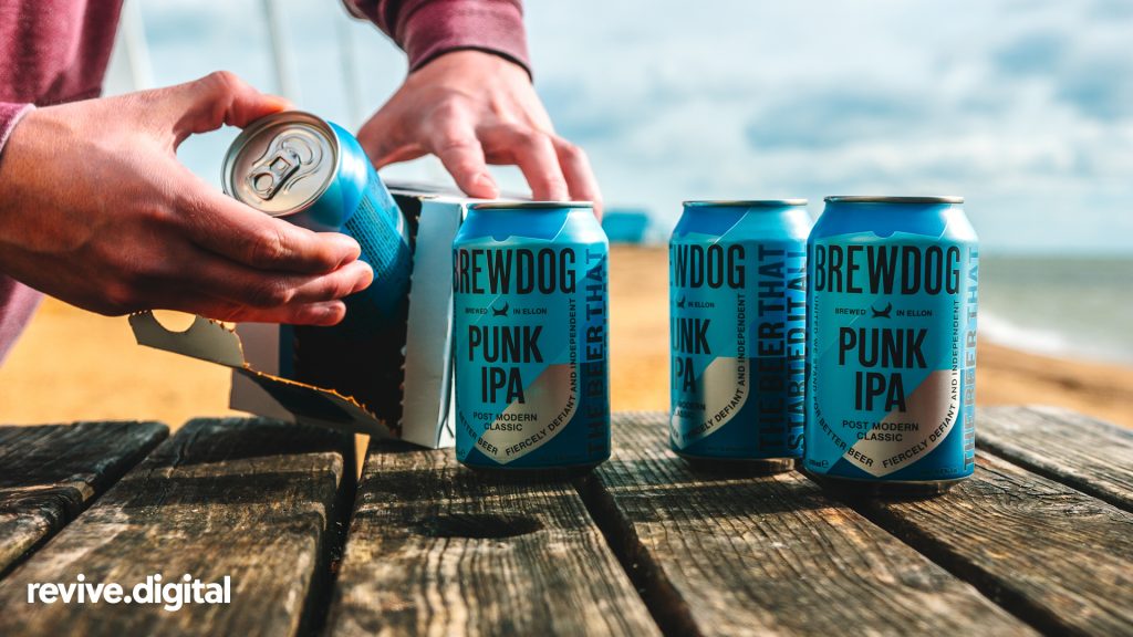
Insights From Our Creative Team
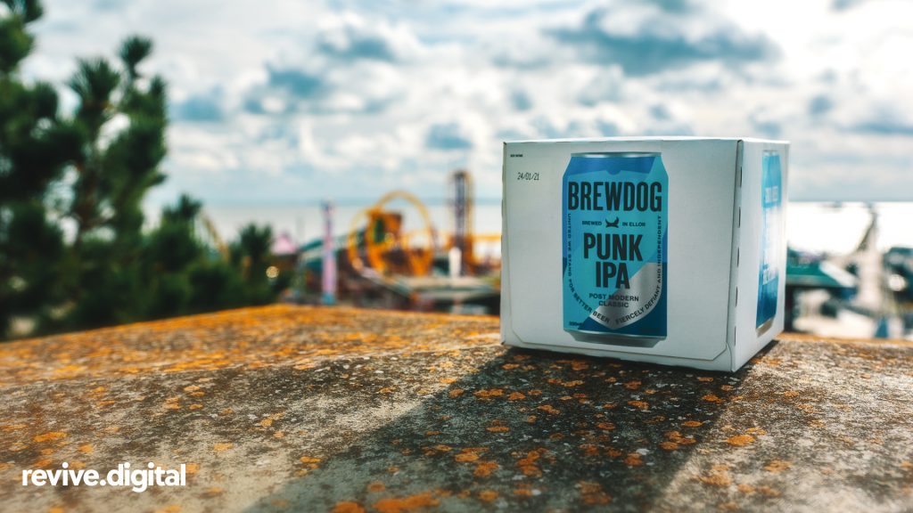
As a digital marketing agency, we keep our thumb on the pulse when it comes to all things design and branding. But, Ellise and James (our graphic design maestros) were especially excited when they saw that BrewDog had rebranded. Here's what they had to say. Ellise says: "For me, BrewDog is one of those companies that always nail their branding and marketing. I may be biased, but I think they’re pretty awesome. They’ve played a very clever card here because climate change is a very popular topic in the news lately and they’ve taken this to their advantage and made their ‘BrewDog Tomorrow Commitment’ surround issues that all focus on ensuring ‘we have a planet to brew beer on’, which you can’t disagree - is admirable. With a new way of thinking, a new visual identity here came at an ideal time and reinforces their message further. In the original branding, the brash and loud typography reiterated their punk anarchy mentality, and with their letterpress style bottles, it really gave them a platform to be noticed within the craft beer industry. To me, this redesign is more of an evolution for BrewDog, the rebellious punk teenager has just grown up and realised it’s time to take themselves seriously and become an activist. And I can’t see a problem with that? They’ve realised their context is so strong, that they don’t need the extras within the design. Less is more here. Stripped back and minimalist, letting the brand now speak for itself. Attracting a wider audience is crucial now, so even the smallest details such as rotating the logo around to read horizontally rather than vertically as it has been before, it just gives more readability when sat on shelves. I applaud Made Thought and their work with BrewDog on this redesign, and I couldn’t wait to get my hands on a can of Elvis Juice when they hit the stores!" 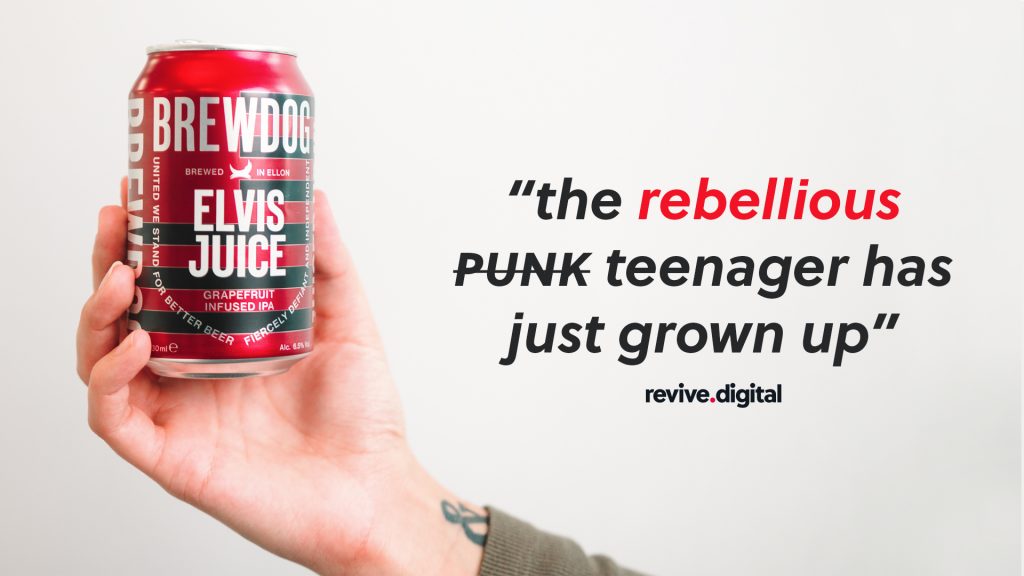 James says: Contrary to what the half the internet seems to think, I really like what I’m seeing with the new BrewDog packaging. As Ellise said, it makes sense to rotate the text round, so it sits horizontally, what’s so punk about having to turn your head to a 90-degree angle to read each can on the shelf? The colour palette used for each can has been expertly executed. The cans now loosely remind me of protest placards, with extinction rebellion having such an impact recently and BrewDogs ‘tomorrow’ campaign launching, perhaps this is a subconscious link, either way, the design work is extremely fresh and on point. Historically, people are averse to change, more often than not, rebrands are greeted with horror and disgust, in very few cases does it ever last though? The bit I don’t get, is that the packaging supposedly isn’t punk anymore?! A common misconception about ‘Punk’ is that it's all about Mohawks, safety pins and studded leather jackets, it couldn’t be further from the truth. Punk is about having something to say, making a point, standing up for what you believe in and sticking it to the man. To say that the old packaging was more ‘punk’ is showing a lack of understanding for the term. The new BrewDog packaging is loud and proud, its got a message and its shouting it from the rooftops, it wouldn’t surprise me if other brands follow suit, its a positive change and one to embrace.
BrewDog's On-Going Sustainability Initiative
BrewDog recently announced it will give fans the chance to own shares if they trade in 50 empty beer cans. The move called "Cans for Equity", is a new way for the general public to join BrewDog’s "Equity for Punks" scheme, which has raised almost £75 million over the past 10 years. It comes in tandem with other pledges that are intended to tackle the impact that beer production has on the environment.
- "Tomorrow Fund": The company will invest £1m a year in research and initiatives to help the brewing industry have a positive global impact.
- "Indie Trash Cans": They have made a pledge to "upcycle" used beer cans from any company by refilling them with their own beer.
- "Once Beer Vodka": Any beer that doesn't meet a certain standard of quality will be distilled and turned into vodka instead of becoming wastage.
- "DIY Dog": The company said it would encourage everyone to brew their own beer at home, to cut down on transportation miles.
- "BrewDog Freehouse": BrewDog has shared the recipes of their back catalogue to everyone. They will now add all of their beer knowledge to catalogue.
Final Words
So, back to our original question; has BrewDog lost its punk-inspired spirit? Not in the slightest. The new branding looks so much more iconic, and the newly placed typography makes an even bolder statement which relays back to their roots (being Punk!). BrewDog have been redefining the craft beer scene for years now, and this marks a new dawn for the business. They have always had a commitment to continuously raise the bar and set new standards for beer and business, and that's exactly what they've done. Congratulations BrewDog, we love it. 