
Formula One Logo Letdown
If you’re a racing fan, then you might have heard about the disagreements sweeping through Formula 1 news. Yes… they’ve decided to change their logo, and many aren’t too happy about the new design. Liberty bought the brand in January, and are hoping that the new design will help widen F1’s appeal and attract new audiences. Chairman Chase Carey has commented that it will, ‘emphasise the excitement and fresh energy,’ of the sport, however, many existing fans aren’t impressed. 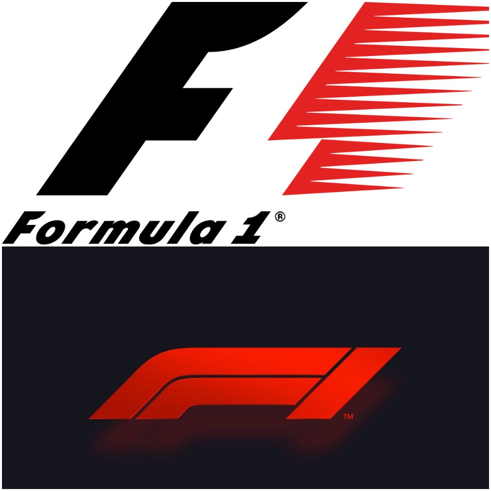 The previous logo was introduced in 1987 and has come to be seen as classic by many, but as soon as the new one was unveiled, a firestorm started on Twitter. Lewis Hamilton himself made the statement regrading the change saying ‘Imagine if Ferrari changed theirs,’ commenting that the new design wasn’t ‘iconic’ like the old. Times change and brands do as well, with plenty of companies having changed their logos over the years, so what is it about this particular change that seems to have annoyed so many fans? As the saying goes ‘If it ain’t broke, don’t fix it,’ but that can’t hold true all the time. No company wants to stay static for long periods of time so when major changes happen, like new ownership, then often branding changes to reflect that. With the new ownership of F1 it’s not surprising that a rebrand was on the cards. This is Liberty's first major change to Formula one since acquiring the company, but according to an official statement, the new design was never intended to majorly disrupt or alter the brand in any way. "We're not looking to change the sport, we're looking to provide a fresh innovation and energy to a great sport that we can enhance in a number of ways." The new logo isn’t even a far cry from the old, so what about these seemingly simple design changes had fans crying in outrage, calling it things like a , 'soulless doodle?'
A logo’s purpose
If there’s one thing a logo should do, it’s to stick in people’s minds as well as convey, not only what your company does, but the way in which it does it. Sounds like a lot of work for just one image doesn’t it? The old F1 logo certainly accomplished those things, the design reflecting the speed of the sport and the stark colour-scheme making for a simple yet recognisable image. The new design is even more minimalist than the previous but keeps a lot of the similar elements, though it seems to have good for sleeker shapes and a lot less negative space. However, is it an improvement?
Time for change
Change can be frightening and annoying to people, especially when it's a change to something that's stayed the same for literal decades. However, F1 is hardly the first company where a new logo design was originally met with anger. When Instagram changed their own logo a year ago, many were resistant to the new pink-heavy colour-scheme and flatter design, yet this wasn't an annoyance that stuck around for very long. You aren't going to find many people nowadays talking about how much better the old Insta logo was.  On the other hand, there's a logo like the 2012 London Olympics logo, which is a design loathed by the vast majority when it was first announced and still isn't looked back on too fondly five years later.
 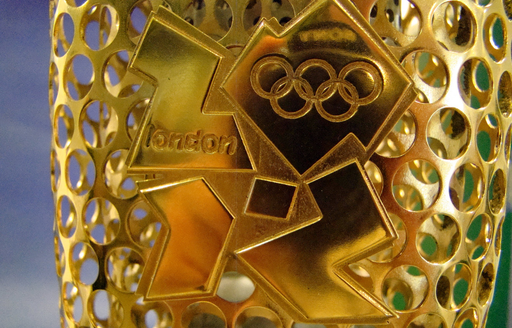 So which category will F1 fall into? Whether people will come to like the new logo as an improvement on the old, or if it will always be hated is something that only time will tell. Companies are constantly re-branding themselves to showcase where their business is heading; is it time for you as well? If you’re looking for logo help then make sure to have a chat to us about your ideas! Also check out our Facebook page for more helpful insights.